Human Genome Analysis Lab 4 : Publication Graphics
Learning objectives
- Be able to add title, axis labels, legends, colors to ggplot graphs
- Resize graphs in RMarkdown
- Print graphics to a file (e.g. jpeg, pdf)
- Loading images into a RMarkdown file
- Making interactive graphs and tables in RMarkdown
Fine tuning ggplots
Today we will use the Cookbook for R by Winston Chang for tidying up our graphs. Please take your time and go through the following web pages. Copy and paste the example code into R Studio.
Here are a couple of cheatsheets that can be useful
Controlling graph size in RMarkdown
In the opening line of the RMarkdown code chunk {r} you can control the output of the code, graphs, tables using knitr syntax. For example if {r, eval = FALSE} the code will not be run, but will be shown. If {r, code = FALSE} the code will not be shown, but will be run and the output will be shown (useful in reports where the reader is only interested in the results/graphs, but not the code). You can also suppress error messages and warnings so that the reader isn’t bothered by them (but you should take notice).
The dimensions of an individual graph in the RMarkdown document be adjusted by specifying the graph dimensions as below.
# to adjust figure size {r, fig.width = 6, fig.height = 6}
SNPs$chromosome = ordered(SNPs$chromosome, levels=c(seq(1, 22), "X", "Y", "MT"))
ggplot(data = SNPs) +
  geom_bar(mapping = aes(x = genotype, fill = chromosome)) +
  coord_polar() +
  ggtitle("Total SNPs for each genotype") +
  ylab("Total number of SNPs") +
  xlab("Genotype")
Graphic Output
You may have realized that you can export plots in R Studio by clicking on Export in the Plots window that appears after you make a graph. You can save as a pdf, svg, tiff, png, bmp, jpeg and eps. You can also write the output directly to a file. This is particularly useful for controling the final dimensions in a reproducible way and for manuscripts.
# Plot graph to a pdf outputfile
pdf("images/SNP_example_plot.pdf", width=6, height=3)
ggplot(data = SNPs) +
  geom_bar(mapping = aes(x = chromosome, fill = genotype))
dev.off()
## png
## 2# Plot graph to a png outputfile
ppi <- 300
png("images/SNP_example_plot.png", width=6*ppi, height=6*ppi, res=ppi)
ggplot(data = SNPs) +
geom_bar(mapping = aes(x = chromosome, fill = genotype))
dev.off()## png
## 2For more details on sizing output Cookbook for R - Output to a file - PDF, PNG, TIFF, SVG
RMarkdown loading images
Sometimes it is useful in controling the image layout for a report to file with the graph and then subsequently load it into the .Rmd file. This works with png files, but not pdfs. You can also upload images made with other bioinformatic tools into your RMarkdown report.
# This is the RMarkdown style for inserting images
# Your image must be in your working directory
# This command is put OUTSIDE the r code chunk
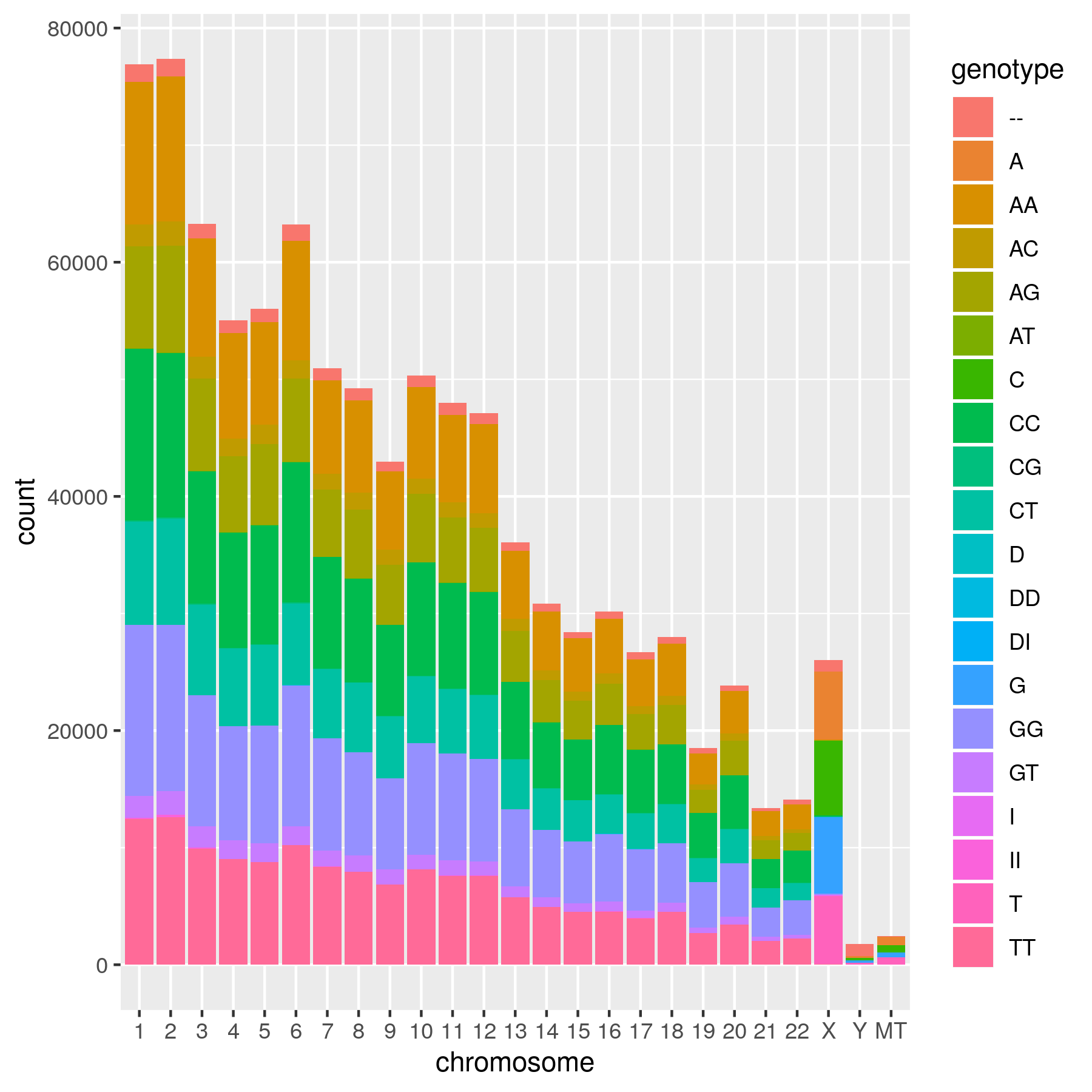 
Genotype counts per chromosome
# This is an alternative way using html.
# Remember that it must be in your working directory or you will need to specify the full path.
# The html is put OUTSIDE the r code chunk.

<img src="images/SNP_example_plot.png" alt="Genotype counts per chromosome" style="width: 600px;"/>
Another way to present a graph without the code is adding echo = FALSE within the r{} chunk - {r echo = FALSE}. This prevents code, but not the results from appearing in the knitr file.
Interactive graphs and tables in RMarkdown reports
With plotly/ggplotly (https://plot.ly/ggplot2/) you can make interactive graphs in your lab report.
# Version 1 1
library(plotly)
p <- ggplot(data = iris, aes(x = Sepal.Length, y = Sepal.Width, color = Species)) +
  geom_point()
ggplotly(p)
# Version 2
library(plotly)
ggplotly(
ggplot(data = iris, aes(x = Sepal.Length, y = Sepal.Width, color = Species)) +
geom_point()
)You can also make interactive data tables with the DT package (https://rstudio.github.io/DT/) *** Don’t do this with tables of hundreds of thousands of rows (as in your complete SNP table)
Exercises
Exercise 1
Add title and labels for the x and y axis to Lab3 ex1. Color the bars blue
Exercise 2
To Lab3 ex3 add more defined x and y axis labels, add a title, Change the colors of the genotypes, so that the dinucleotides (e.g. AA) are one color, the mononucleotides (A) are another and D’s and I’s a third color. One way to do this is to specify the color of each genotype.
Exercise 3
From Lab3 ex5, make an output png file, then load the file into report using the RMarkdown or html format.
Exercise 4
For Lab3 ex6 add more descriptive x and y axis labels, add a title, make the x-axis for each graph readable in your final report file.
Exercise 5
Turn Lab3 ex6 into an interactive graph using plotly
Exercise 6
Make an interactive table of the SNPS found in on the Y chromosome from the 23andMe_complete data set